DORA Regulation: Implications for Businesses Using Microsoft
The DORA regulation imposes a technical tightening of Microsoft Dataverse. Discover the risks and solutions to secure your CRM.
Today, especially through generative AI, unprecedented volumes of data are continuously created. However, most businesses struggle to extract value from it. Why? Because reports are often illegible, overloaded, or don't answer the right questions.
That's where the comes in Data visualization, a strategic tool to transform complexity into clarity and accelerate decision making. This article reveals the fundamental principles, the mistakes you should absolutely avoid, and how Power BI can radically change the way you manage your business.

The brain processes images much more quickly only the text. MIT research has shown that the brain can identify an image in just 13 milliseconds, which is why a well-designed graph allows you to capture a statistical trend in seconds, whereas analyzing a table with numerical data would take several minutes.
So the visualization is fundamentally changing. Your relationship to data because it decreases the cognitive load needed to understand them. Instead of using your short-term memory to mentally compare dozens of values, with a good visual, you can immediately see patterns, anomalies, and opportunities.
That is why, conversely, a A poorly designed dashboard represents a much more insidious danger than the total absence of reporting because it creates an illusion of control while potentially misleading you for your decisions.
For example, when you simultaneously display 15 indicators at the same visual level, with garish colors and 3D effects, the brain no longer knows where to look. When all the KPIs are presented with the same importance, none really stand out.
In other words, the absence of a visual hierarchy paralyzes the decision. A bad dashboard is worse than no dashboard because in addition to making you believe that you are in control while browsing blindly, it consumes resources and generates frustration.
Your sales, marketing or customer service teams don't have No need to be SQL or Excel experts to understand a well-constructed graph. On the contrary, data visualization makes insights accessible to all profiles, technical or not, and translates data into universal language.
For example, a sales team that is reluctant to use their CRM will tend to change their mind quickly once presented with integrated Power BI dashboards that allow their members to clearly visualize their pipeline, current opportunities, and individual performance.
It is the principle of Self-service BI (Self-service Business Intelligence): everyone can explore data relevant to their business and create their own analyses, without always depending on the IT team or data analysts.
In doing so, data visualization plays a crucial role in democratization of data within your organization and in the establishment of a data-driven culture common to the whole company and not only to data analysts.
The fundamental principle of successful visualization is based on a formula: Less is more. Each element on your dashboard should have a clear purpose and be used to understand the data. Systematically categorize each item by asking yourself: Is it a signal or a noise?
Anything that does not provide useful information is Visual noise that distracts attention and complicates reading. Anything that falls into this category should be eliminated: overly marked grids, thick borders, drop shadows, 3D effects are all decorative elements that pollute your message without contributing anything.
For example, 3 to 6 well-contrasting colors are sufficient in most cases, depending on the complexity of your visualization. Each color should have a consistent meaning: green for positive performance, red for alerts, gray for neutral data.
Be careful, however, simplicity is never the result of chance. On the contrary, it is the result of intentional design work where each choice is weighed to serve understanding.
Not all graphics are interchangeable. Each type of visualization is used to convey a certain message, and the wrong choice can make your data incomprehensible. So:
Always ask yourself this question:”What message should I get across?” The answer determines the appropriate type of graph, the one that best answers the question asked with the least cognitive effort possible.
Your eye should be immediately drawn to the most important information on your dashboard. To do this, start with apply the principle of the inverted pyramid: critical KPIs should appear at the top of your screen, in a size large enough to be captured at a glance. The details are below, accessible for those who want to deepen their analysis.
Remember that color is a powerful ally for:
A good dashboard tells a story with an obvious entry point and a natural reading logic that gradually leads to greater depth.

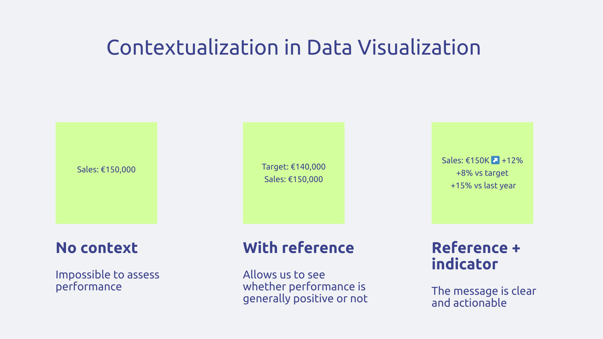
A number doesn't mean anything in itself, it doesn't provide actionable insight. Indeed, does 150,000 euros in sales this month represent a good or a bad performance? Impossible to say without context.
That is the reason why, each metric must be accompanied by at least one reference that allows it to be evaluated. This reference can for example be your objective, the performance of the previous period, the average of the last six months or a sector benchmark. The idea is to provide a point of comparison so that users can interpret the information.
In the same spirit, to add an essential layer of meaning, there is Indicators of change such as a “+12%” mention with a green arrow next to your sales. Thanks to this type of signal, the user instantly knows that you are on a positive dynamic without the need to go through mental calculation. In absolute terms, the reference to sales figures from a few months ago is enough to understand, but the green arrow with the “12%” accelerates and makes it easier to understand the message.
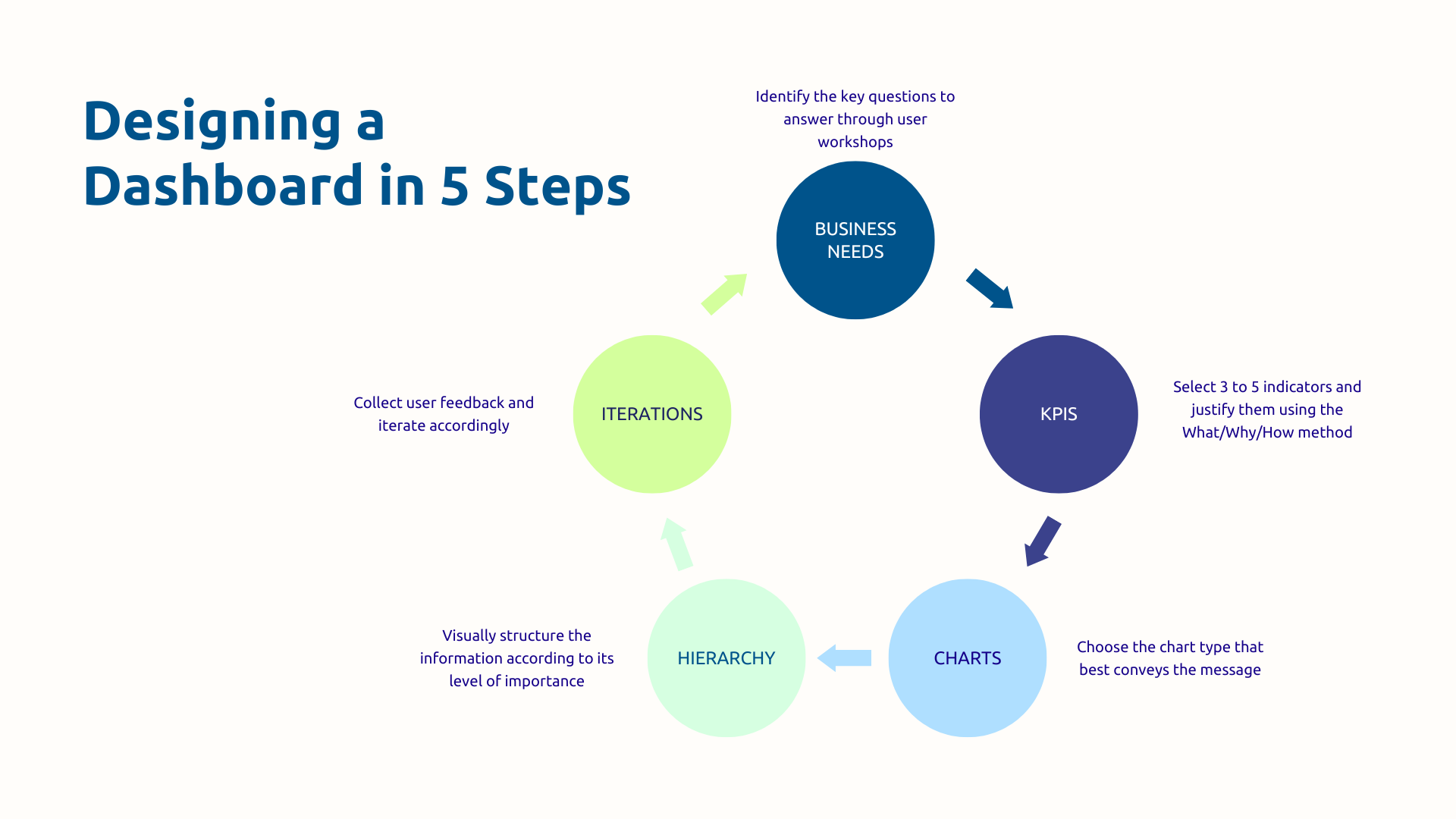
The most common mistake in visualization projects is using available data to build dashboards. This approach invariably produces tools that are unused because they are disconnected from real needs.
The right approach is to follow the opposite logic. Start by identifying the decisions your users need to make every day, every week, every month. What questions do they ask themselves before taking action? What trade-offs should they make? These are the business questions that should structure your visualization.
Apply the method of”What, Why, How“for each indicator:
If you can't provide satisfactory answers to all of these questions, then the indicator probably doesn't belong on the dashboard.
Resist the temptation to “show everything because you can”. 3 well-chosen and contextualized KPIs are infinitely more effective than 15 metrics without hierarchy and which do not answer any of the questions your users ask themselves.
Obviously, a CEO, an operational manager and a data analyst do not have the same visualization needs at all.
Ignoring these differences leads to creating tools that don't satisfy anyone. That is why the level of detail must adapt to the level of decision :
Another influencing factor to be taken into consideration during design: the frequency of consultation. Thus, a dashboard intended for daily management must be refreshed in real time or almost real time and highlight immediate alerts, while a monthly strategic review will focus on developments over several months and historical comparisons.
Just as business needs evolve as new data becomes available and strategic priorities change, your dashboard cannot remain frozen in its launch version but grow with your business.
To do this, analyze the real use of your dashboards. Which are the most consulted? Which are completely ignored? What visualizations generate the most interactions? This behavioral data reveals what really brings value and what can be removed or redesigned.
Complete this initial analysis with a regular feedback process with your users through monthly or quarterly sessions where they can answer three simple questions:
In addition to classic graphics, Power BI offers around thirty native visuals and gives access to a extensive library of custom visualizations created by the community on AppSource. The result: you always find the right format for your message.
Another reason for the success of Power BI is its ability to connect more than 100 data sources simultaneously different. This means that your Dynamics 365 data, Excel files, Google Analytics, marketing automation platform, and support system can all converge into a single unified dashboard.
Power BI is also a user experience considerably enriched by native interactivity of the solution. For example, filters allow you to refine the view according to various criteria and drill-down allows a gradual exploration from the general to the particular.
As a result, your users become actors in their process in a collaborative environment, and not simply spectators of a static report. This is how Power BI makes data accessible, understandable, and actionable for your entire organization.
One of Power BI's most powerful assets is its seamless integration with Microsoft's CRM and ERP ecosystem.
Native connectors eliminate technical friction: with Power BI, go directly to Dynamics 365 Sales to visualize your sales pipeline, to Dataverse for your customer data, to Customer Service to analyze your support tickets, to Finance to monitor your financial indicators. No manual extraction, no intermediate files, no complicated synchronization.
In addition, your dashboards can be embedded directly into the Dynamics 365 interface so that your salespeople can consult their performance without leaving their usual CRM.
Finally, the automatic refresh feature also changes your relationship with management because Power BI can update your indicators according to your needs:
With Power BI and Dynamics 365, data becomes actionable where your teams work : no need to multiply tools and waste time browsing.
Democratizing access to data does not mean leaving room for anarchy. That's why Power BI includes features that allow you to finely control the distribution of your visualizations and ensure IT compliance.
First of all, the access rights are managed by user, by group or by role. You precisely define who can see which reports, who can edit them, who can share them. This granularity ensures that each person only has access to information that is relevant to their perimeter.
Row-Level Security (RLS) pushes security even further: a regional director will automatically only see data from his own region in a national dashboard; a manager will only be able to consult the performance of his team.
It is a segmentation that applies transparently without having to create different reports for each profile.
In short, data visualization goes far beyond the framework of an aesthetic exercise to become a real strategic driver of performance. By transforming the complexity of your data into visual clarity, you radically accelerate your decision-making and align all your teams with the same understanding of reality. Power BI and the Microsoft ecosystem now offer the tools to achieve this ambition, provided they are deployed with a solid business approach and expert support.
Do your current dashboards not allow you to manage effectively? Contact Askware for an audit of your practices and discover how Power BI can transform your management.
A report presents data in a detailed and chronological manner, often intended to be read in its entirety and archived. It tells the complete story of a period or activity with lots of context and textual explanations. A dashboard is designed for quick and regular consultation: it displays only the essential indicators to monitor a situation and make immediate decisions. The document report, the pilot dashboard.
Because no one has time to decipher Excel tables of several hundred rows before each decision. Visualization harnesses the brain's natural ability to process visual information quickly to instantly reveal trends, anomalies, and opportunities. It also makes it possible to create a common language in the organization: all profiles, technical or not, understand the same information and can contribute to strategic discussions without entry barriers.
Always start by identifying the real business questions that the dashboard needs to answer rather than using the available data. Organize workshops with future users to understand their real needs and priorities. Then, apply the principles of visual simplicity: three colors maximum, a clear hierarchy with the essential KPIs at the top, and graphics adapted to the message to be conveyed. Quickly launch a first functional version and improve it iteratively by regularly collecting user feedback.
Our experts share their vision of best practices and technological trends to ensure the success of your digital transformation.