The limits of low code: A comprehensive guide for IT decision makers
Discover the true limits of low code and when technical expertise is needed. Guide to a successful low code strategy.
We are regularly required to deploy new interfaces: Power Apps applications for sales teams, customer portals on Dynamics 365, custom SharePoint intranets. However, each interface is in the process reinventing its own buttons, forms, and navigation. As a result, your users find themselves navigating an inconsistent digital patchwork. As a result, your developers waste precious time recreating the same components over and over again while your technical interface debt explodes.
To face this challenge and have a fluid and interconnected IS, you will have to go through a Design System, the living repository that guarantees coherence AND acceleration in your digital ecosystem. In the rest of this article, we'll look at what it is, how it helps you deploy quality interfaces, and how to build it in Microsoft.

Design System is a set of evolving documents that brings together your design principles, your reusable UI components, your interaction guidelines and the corresponding code. It is he who will guide the design of all the digital interfaces of your company.
Where a graphic charter defines colors and logos for your marketing materials, the Design System includes:
It is a Common language that designers, developers, product owners and business teams share.
A Design System is not:
First of all, the development velocity increases drastically because designers save considerable time by assembling pre-designed components rather than by redesigning each element. For their part, developers benefit from components that are already coded, tested and documented that they import directly. As for QA teams, they validate more quickly because the components have already passed unit and accessibility tests. This efficiency allows for a creative focus on business value.
Thus, we were able to see that a new Power Apps application for leave management takes 3 days of development with a Design System compared to 15 days without it.
Then, the consistency of experience extends to all your digital touchpoints. Indeed, your users instantly recognize your business. Cognitive load decreases radically: familiar interaction patterns from one interface to another allow learning to be transferred naturally. This recognition creates trust and improves the perceived quality of your services, both for your customers on external portals and for your employees on internal tools.
Thirdly, the technical scalability becomes easier since you control your technical interface debt thanks to a modular architecture. Since the code is centralized and shared, a bug fixed in a component is automatically corrected in all applications that use it. Scalability becomes simple: do you need to improve accessibility to comply with the RGAA? Instead of updating 50 applications individually, you update all 30 components of your Design System and all applications automatically inherit these improvements.
Who says common language, says better collaboration between teams. This democratization reached its peak in particular with citizen development on Power Platform: your employees who create their own business applications via Power Apps now have access to official building blocks and produce visually coherent and professional applications.
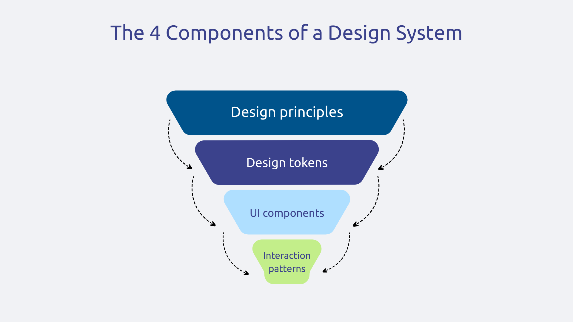
At the top, the design principles define your core values that guide every decision. For example: “Clarity above all”, “Accessible by default”, “Guided but never intrusive.” These principles should be actionable rules. The “Guiding but never intrusive” principle applied concretely to your forms results in contextual tooltips rather than error messages, real-time validation during entry rather than during submission, proactive suggestions without forcing choices.
Just below are the Design Tokens : atomic design variables that define your colors, fonts, spacing, shadows, and transitions. Here, the huge advantage lies in automatic propagation: if your “color-primary” token changes from #0078D4 to a new shade of blue in accordance with your new charter, the 50 components that use it are instantly updated without touching the code of each component individually.
Then come the UI components : buttons, forms, maps, modals, tables. Each component exists with its variants (primary, secondary, outlined) and its states (normal, hover, active, disabled, loading, outlined) and its states (normal, hover, active, disabled, loading, error). The documentation explains when and how to use each version, with visual examples of good and bad use.
Finally, the interaction patterns assemble several components to create complete templates responding to common business scenarios: authentication page, analytical dashboard, multi-step form, search page. These patterns raise your Design System from the “brick” level to the “complete experience” level.
A Design System without governance dies quickly. It is becoming obsolete, fragmented, ignored. Governance transforms your Design System from a punctual deliverable into a scalable product for your business. Governance involves 4 main actions:
Keep in mind that the Design System needs resources dedicated to its continuous maintenance. Without this investment, even the best initial Design System is gradually crumbling in the face of emerging needs and technological developments.
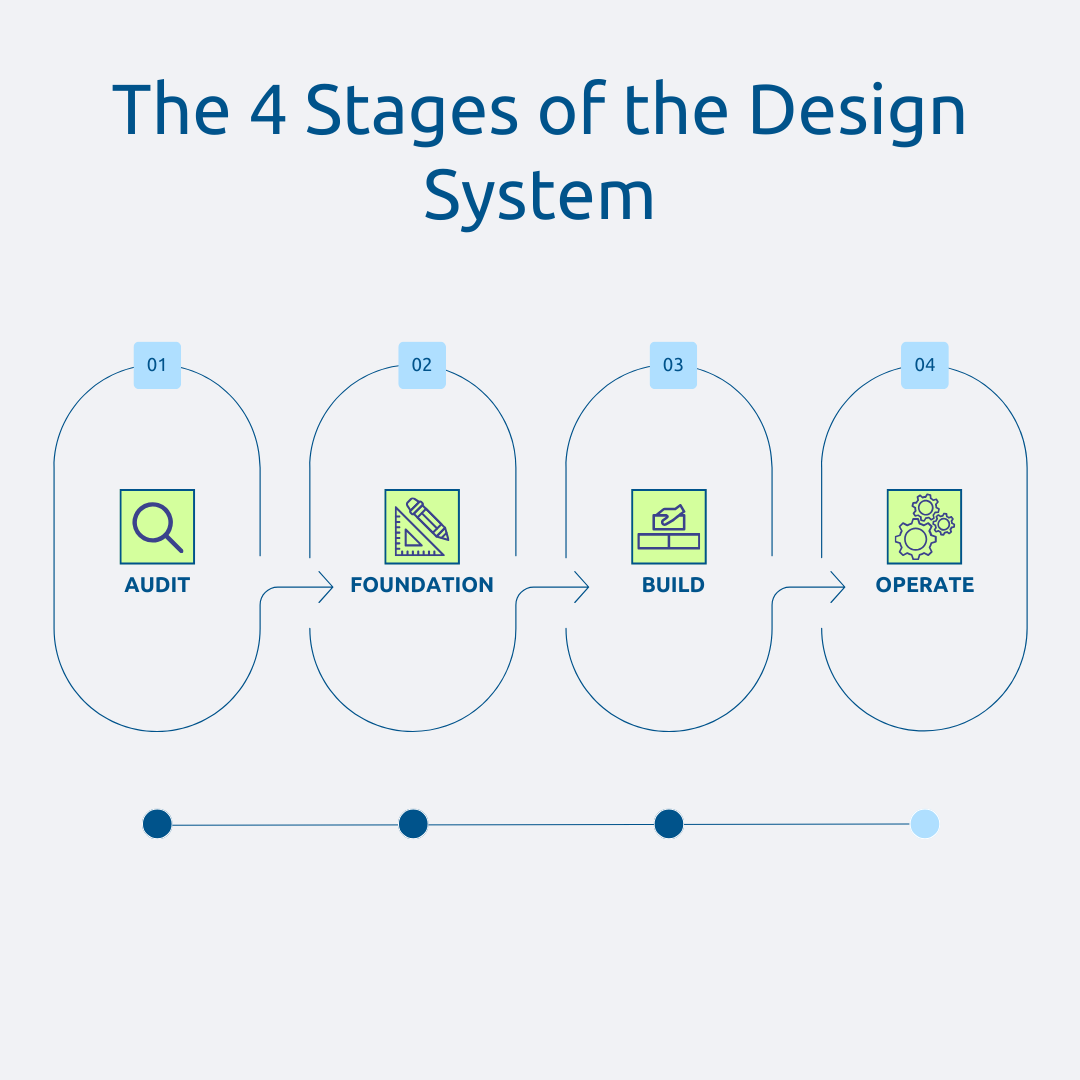
Start with a exhaustive inventory of all your current interfaces: web applications, Power Apps, Dynamics 365 portals, SharePoint sites, custom Teams applications. Systematically capture screens from each interface to build your “UI inventory”.
Then, identify the visual and technical inconsistencies that are currently polluting your user experience. How many different button variants? How many form styles? What navigation patterns are used? This analysis often reveals surprises.
It will also be necessary to think about mapping the patterns that are repeated inconsistently across your ecosystem. These recurring patterns but implemented differently (notification systems, search forms, data tables) become priority candidates for your Design System.
Finally, evaluate the cost of the current inconsistency in terms of duplicated development time, maintenance complexity, user frustration, and support tickets. A well-conducted application refactoring via a Design System precisely avoids starting from scratch.
In short, this audit phase allows you to rationalize what already exists rather than adding another layer of complexity.
Define 3 to 5 design principles that reflect your organization's values and user experience goals, aligned with your business strategy. These principles should be actionable, not empty marketing phrases. They will serve as an arbitration for all your future debates, transforming subjective discussions such as “I like” or “I don't like” into objective evaluations: “is this proposal in line with our principle of accessibility?”
Once these principles are established, create your design tokens, the atomic variables that make up the basic vocabulary of your visual language. Define your colors, fonts, spacings, shadows, and transition times. These tokens become your design “atoms” whose major advantage lies in their automatic propagation: modifying a token spreads the change everywhere instantly.
And then, develop your first basic components, starting small. Resist the temptation to be comprehensive right away. Focus on 10 to 15 essential atomic components: buttons, input fields, labels, icons, badges. For each component, define all its variants and states (normal, hover, active, focus, disabled, loading, error, success).
In parallel with this creation, Document all usage guidelines of each component. This documentation specifies its use, its configurable properties, and visual examples of good and bad use. Without this documentation, your components will be misused or ignored.
With these solid foundations, you can now build more complex components that meet specific business needs.
The priority is to Expand your component library with more sophisticated elements like data tables, datepickers, confirmation modals, or navigation components. Don't aim for completeness but focus on what meets your recurring business scenarios.
The next step is to Assembling your atomic components into patterns for recurring scenarios in your organization. Identify repeat user experiences: authentication processes, management dashboards with KPIs, data entry forms, search pages with advanced filters, etc.
For each pattern, create complete templates ready-to-use that combine multiple components into a cohesive experience. For example, your “Business Dashboard” pattern could include: a header with breadcrumbs and contextual actions, KPI maps at the top highlighting critical metrics, interactive charts with filters below, and a paginated data table at the bottom.
In parallel with this construction, conduct rigorous tests of accessibility and performance on all your components and patterns. Validate RGAA compliance, test with keyboard only, check color contrasts, test with screen readers. In terms of performance, measure the loading time and optimize the weight of the assets.
Your Design System is technically ready. Now it's time for operational deployment.
Start with a pilot application to test your Design System in real conditions before widespread deployment. Choose a project that is representative enough but not critical to the activity. This pilot phase reveals the missing components, the guidelines to be clarified, the technical integration problems. Systematically collect feedback from the project team: what worked well? What was missing? What was confusing?
And then, Deploy gradually on other applications in successive waves. Don't try to migrate all of your assets at once. Prioritize new applications first (they naturally adopt the Design System) then existing applications during their major evolutions.
To support this deployment, you will have to do two things we've already talked about: set up your Design System team and formalize your contribution and versioning process. Establish a regular release rate (monthly or quarterly depending on your context) with systematic communication of changes.
Finally, animate continuous improvement by listening to user feedback, by monitoring technological developments (new frameworks, new UX best practices), by integrating new IT compliance regulations (accessibility, RGPD).
For Canvas Apps, create a Power Apps Component Library that implements your Design System. Power Apps offers this feature natively: first you develop your buttons, forms, maps, and other items only once in this central library. Then, any new Canvas App can import this library to immediately benefit from all your standard components. In doing so, even citizen developers produce visually consistent and professional applications without worrying about design.
For Power Pages (formerly Power Apps Portals), use custom themes and custom CSS to apply your Design System to portals. You can override the default styles to match your colors, fonts, spacings, and components. The Power Pages portals thus become perfectly aligned with your corporate visual identity.
Thanks to these tools, your business employees maintain their autonomy to quickly create applications that meet their specific needs, but they do so within a quality framework that guarantees consistency and professionalism. Instead of stifling innovation, you're channelling it intelligently.
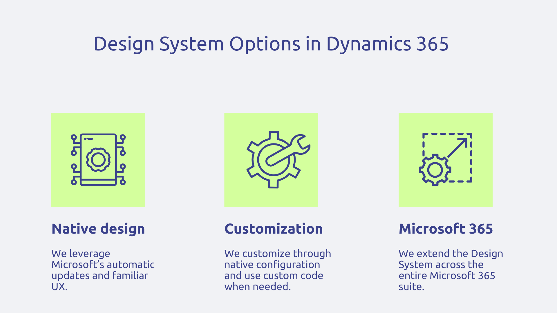
In Dynamics 365, you have to decide between adopting the native Microsoft design or supercharging it with your own Design System. As Microsoft invests heavily in the modern Dynamics 365 interface, adopting this native design has advantages: you automatically benefit from improvements during updates, and your users get a familiar experience if they use other Microsoft tools.
However, for branding reasons, you may want to customize forms, views, dashboards and especially customer portals via Power Pages. So favor customizations via native configuration when possible, and reserve the custom code for really specific elements. A typical use case: a completely rebranded Customer Service customer portal where navigation, ticket forms and knowledge base adopt your visual identity.
Note that your Design System can extend to all of Microsoft 365. For SharePoint, create custom themes that apply your colors and fonts to all of your intranet sites. In Teams, your custom applications (tabs, bots, extensions) naturally take up the components of your Design System. Viva Connections allows you to customize the home dashboard.
In the end, you offer a seamless experience through which your employees perceive a unified ecosystem. Imagine an employee who starts their day in Dynamics 365 Sales to review their sales pipeline, then opens a custom Power App to enter their expense reports, then connects to the SharePoint HR portal to view their payslips.
This consistency significantly reduces support tickets because users naturally transfer their learning from one tool to another. The Design System thus becomes the common thread of all the digital contact points in your company.
Keep in mind that building a Design System is a gradual process. Start small with your core components, iterate based on feedback, and gradually expand the scope. Each step brings you closer to a truly coherent and scalable digital ecosystem.
Does your digital ecosystem deserve a Design System? Contact Askware for a scoping workshop that will assess the maturity of your environment and identify structuring opportunities, especially in the context of your Power Platform and Dynamics 365 deployments.
The graphic charter documents your visual identity (logos, colors, fonts) for marketing materials, in a static way. The Design System goes much further: it includes coded UI components, interaction rules, accessibility guidelines and governance to build coherent and scalable digital interfaces.
First, audit your existing interfaces to identify inconsistencies. Then define 3 to 5 design principles, create your design tokens, and develop 10 to 15 basic components. Document everything and establish clear governance. Get started with a pilot application before gradually expanding. The important thing is to have a solid foundation rather than aiming for immediate comprehensiveness.
A Design System accelerates development by eliminating repetitive work, guarantees a consistent experience that facilitates adoption, reduces technical debt thanks to shared code, and improves collaboration between designers, developers and businesses. In Power Platform, it allows even non-developers to build enterprise-grade applications.
Our experts share their vision of best practices and technological trends to ensure the success of your digital transformation.